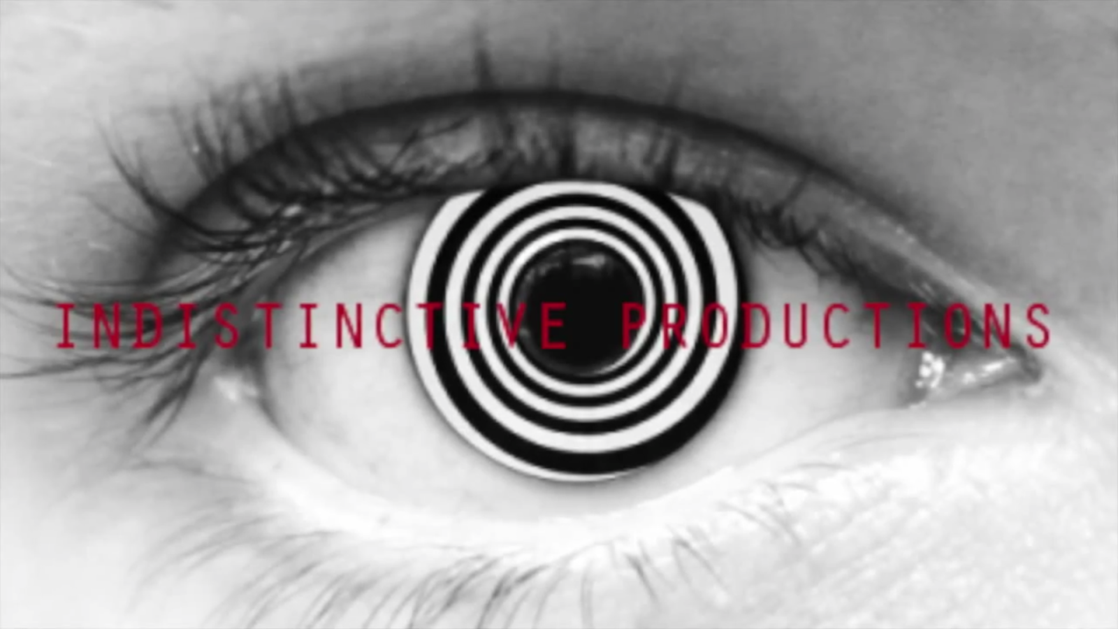
Our Production Company name is:
We chose the word "INDISTINCTIVE" as our production company would be focusing on Film Noir genre type films, which is fitting to the definition that an object/person does not have a distinct feature. Which is also apparent in Film Noir as most of the lighting makes the characters or certain objects indistinct, so the audience cannot see clearly.
This certain title font was used originally from Dafont.com, which is called "ERTHQAKE". We used this originally because it suits the definition of indistinctive as it is blurry and not clear.
We are using this logo for our production company as the clear picture shows the eye looking, but it is filled with a spiral to highlight that the vision when watching our films is delusional and indistinct.